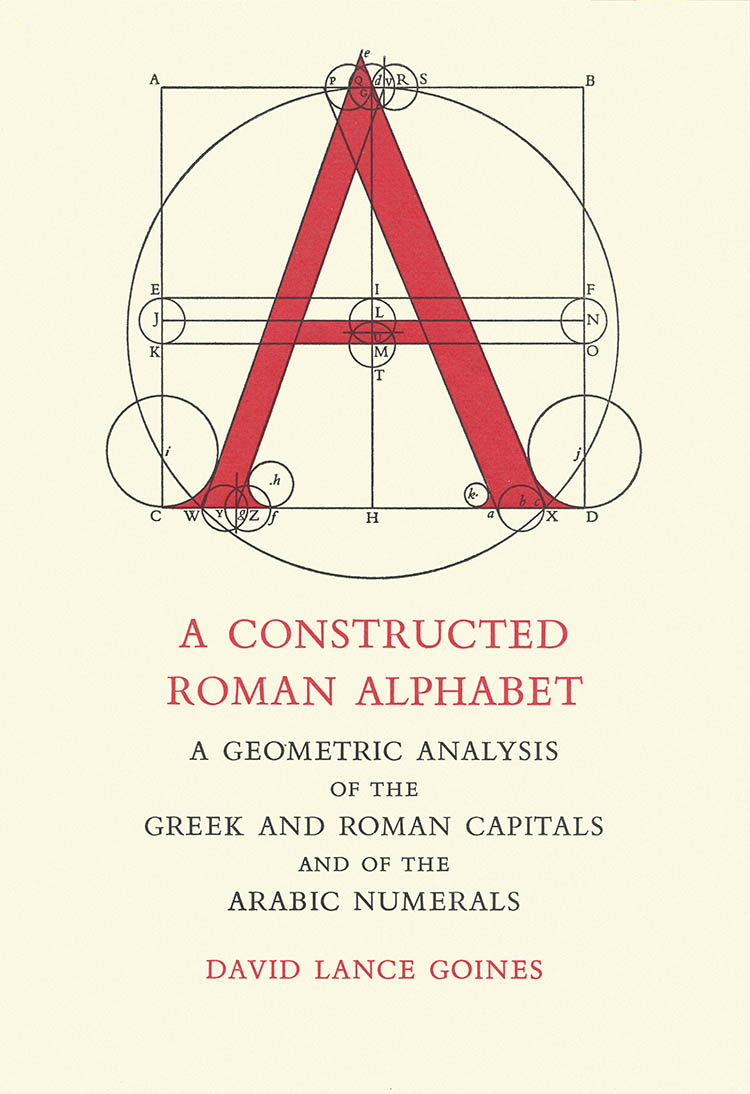
4 Aralık 2012 Salı


Classifying type: 


 Humanist | Old Style | Transitional | Modern
          Slab Serif (Egyptian) | Sans Serif


As the idea of  humanism occured in Renaissance,new humanistic writings required and new fonts are created.


Blackletter (also know as Block,GothicFraktur or Old English) started to change and become more secular, legible and elegant.


The Humanist types (sometimes referred to as Venetian) appeared during the 1460s and 1470s.

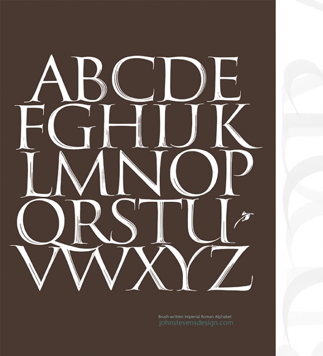
Have strong roots in calligraphy.


And here are some examples of Humanist faces:

JensonKennerleyCentaurStempel Schneidler, Verona, Lutetia, Jersey, Lynton.
Old style types are characterised by greater contrast between thick and thin strokes, and are generally speaking, sharper in appearance, more refined. 

Original Garamond


  • On the ascenders are more wedge shaped
  • more perpendicular (upright) position
  • horizontal crossbar. 


The very first italic type in 1501. 


Some more Old Style faces: Berling, Calisto, Goudy Old Style,GranjonJansonPalatinoPerpetuaPlantinSabon and Weiss.


 The Renaissance Masters of Type                                          The Baroque Masters of Type

Aldus Manutius                                                                                 Philippe Grandjean
Claude Garamond                                                                            William Caslon
Geoffroy Troy                                                                                    John Baskerville

                                                                                                           Pierre Simon Fournie


18th century Transitional style typefaces.

First Transitional (or Neoclassical) style typeface, much less influenced by handwritten letterforms. 

TheRomain du Roi or King’s Roman, commissioned by Louis XIV for theImprimerie Royale in 1692, is often referred to as Grandjean’s type but produced by a committee and  Jacques Jaugeon was one of the committee members. Also known as the Paris Scientific Type, the name of the committee.

Notable figures are John Baskervile (1760's), Pierre Simon Fournier who developed the ‘point’ system (Fournier Scale), William Caslon whose types were based on the Dutch Old Style.


The first Modern typeface is attributed to Frenchman Firmin Didot (son of François-Ambroise Didot), and first graced the printed page in 1784. Followed by the archetypal Didone from Bodoni.

The Masters of Type of the Enlightenment

François Ambroise Didot
Giambattista Bodoni


1. High and abrupt contrast between thick and thin strokes;
2. Abrupt (unbracketed) hairline (thin) serifs
3. Vertical axis
4. Horizontal stress
5. Small aperture
 It is easy to see Bodoni or Didot.

13 Kasım 2012 Salı

The First Infancy of Printing.

Incunabula

The term stared to use in the late 17th century for printed books. It was first used in Bernard von Mallinckrodt's pamphet "Of the riseand progress of the typographic art", published in Cologne in 1639. The phrase was  prima typographicae incunabula, "the first infancy of printing".

A single sheet that is not handwritten or printed image. They are usually very difficult to find and it is needed an expert to verify the nature of the sheet.


Rag Paper

First paper was made of Papyrrus was expensive so parchment replaced it. In China bamboo or silk were alternatives for paper but they were also not convenient. So books or newspapers were rare luxury objects and there was illiteracy. 

Steam-driven paper making machines made it really easy to produce paper and it become very cheap. These machines are the basis for most modern papermaking. Fiber from wood pulp is used to make paper.

By the introduction of cheap paper all book and newspapers become reachable for everybody. It is possible to say that new paper technology was the part of Industrial Revolution.

Johannes Gutenberg (1398-1468)

His invention of the technology of printing with movable types was so efficient that it led to a boom in the production of texts in Europe.

Block printing was an existing method and it was used in Chinese texts but Gutenberg used it in more efficiant way and discovered metal typography that could be reproduced much more quikly. As a result, first mass-produced work published, Gutenberg Bibles in 1455. This was a cultural revolution because demonstrated the power of the printing press by selling copies of a two-volume Bible (Biblia Sacra) for 300 florins each. This was the equivalent of approximately three years' wages for an average clerk.


metal types

6 Kasım 2012 Salı

Medieval Europe's Beautiful Book Designs

Illuminated Manuscripts

Manuscripts decorated with gold or silver or now we can call just any decorated manuscriptas illuminated manuscript. 

Earliest examples are from the period AD 400 to 600 but the majority of surviving manuscripts are from the Middle Ages.


Scriptorium was a room for professional copying of manuscripts. A separate class of specialists were adding rubrics and illumination to manuscripts.


Technique

  • The text was usually written first
  • General layout of the page was planned
  • The page was lightly ruled with a pointed stick
  • The scribe went to work with ink-pot


After the invention of printing press, these beautiful hand written books gave their places to books that aremass produced and became everyday objects.


Initials and Diminuendo

What makes these manuscripts so beautiful and captivating is probably initials and the diminuendo. Diminuendo is the arrangement of type in which a large letter or word leads the eye. Letters starting with a large initial and 
progressively diminishing the point size of the type. It provides a smooth transitio between initial and body text.


Large initial L from a Romanesque Bible
Opening of main text, with large illuminated initial, rubric, and 1-line red initial. (12th century)


diminuendo

A set of sixteenth-century initial capitals, which is missing a few letters


Today, that is also an important  part of editorial design and sometimes used to lead the reader into a chapter of a book or a section of an article.

Designed by Deb Pang Davis for Natioanal Geographic Traveler Magazine


Diminuendo, quote from 'Blade Runner'
Marker and pen on bristol board 19x24"


5 Kasım 2012 Pazartesi

Starting Point of Type Design

The Alphabet

Started around 2000 BC in Ancient Egypt as a representation and continued  in Egyptian hieroglyphs.

Egyptian prototype  ->  The Proto-Canaanite alphabet  ->  Phoenician  -> The Aramaic alphabet  -> nearly all alphabets can be traced 


Phoenician (Phoenician empire, ancient kingdom that was located on the territory of modern-day Syria, Lebanon and Israel)

-> The Aramaic alphabet ->the 7th century BC as the official script of the Persian Empire -> ancestor of nearly all the modern alphabets of Asia.

->  Greek and Berber alphabets

-> Romans -> 9th century BC -> used the Greek alphabet as the basis for the uppercase 
alphabet that we know today.


“Dark Age”  (from 1100 BC to the 8th century) no primary texts survive, only archaeological evidence

From about 800 BC written records begin to appear.


Roman Script

They scribed a rigid, formal script for important manuscripts and official documents and a quicker, more informal style for letters and routine types of writing.

                                                 Square capitals were used
                                         to write inscriptions.

The Romans further important contributions to type design: 

You may find David Lance Goines’ A Constructed Roman Alphabet. 

The book won, among other awards, the 1982 AIGA Book Show Award and the 1983 American Book Award (for typography)

Q A Constructed Roman AlphabetThe instructions to draw the letter Q,

Serif

Originated with the carving of words into stone in ancient Italy.

Baseline

The line upon which most letters "sit" and under which descenders extend.


Book industry (By A.D. 100)

-> lower case letters (developed in the Middle Ages)
-> Codex: A codex (Latin for block of wood, book; plural codices) is a handwritten book


Type Design

An example of Roman Capitals written with a square-cut brush with strokes showing. The basis of the typeface Stevens Titling.


I find this brush writing demontration very interesting.


16 Ekim 2012 Salı

Pictograms, ideograms and logograms

A pictogram or pictograph is a symbol representing a concept, object, activity, place or event by illustration. It is the basis of cuneiform and hieroglyphs.

An ideogram or ideograph is a graphical symbol that represents an idea. Examples of ideograms include wayfinding signage, such as in airports. Commonly used to describe logographic writing systems such as Egyptian hieroglyphs and Chinese characters.

A logogram, or logograph, is a single grapheme which represents a word or a a meaningful unit of language.

Various ancient cultures all over the world use pictograms since around 9000 BC and they began to develop logographic writing systems based on these  pictographic or ideographic symbols around 5000 BC.


Egyptian hieroglyphics and Chinese writing, the characters has their  origins in
the pictorial representations.

Also Calligraphies,  Cuneiforms (ex: The Sumerian scripts as world's earliest systems of writing) were develloped by the help of these pictogrphic and logographic symbols.


Calligraphie


.


Pictogram/ Ideogram 


The distinction between pictograms and ideograms is essentially a difference in
the relationship between the symbol and the entity it represents. The more
‘picture-like’ forms are pictograms and the more abstract derived forms are
ideograms.

 For more information:
 http://www.cambridge.org/features/linguistics/yule/downloads/sample_21.pdf

Modern Pictograms

Today also, pictograms are very usefull and they are everywhere.


Design work for the Beijing 2008 Olympic Games:


Pictogram rock posters:


Ideas Transmitting Through Drawing

Petroglyphs

Eariest were dated to 10,000 to 12,000 years ago and it can be said that they were preparation for writing. Other writing systems such as pictographs and ideograms began to appear arround 7,000 to 9,000 years ago. It is possible to see different symbols in every continent. Each culture has different ways of communication and they have an intersting symbolic or ritual language.

 pre-writing symbols in different cultures

 Also Geoglyphs  are an other way of communication. They are large motives or designs produced on the ground. Most famous one is Nazca Lines in Peru. They were designated as a UNESCO World Heritage Site in 1994. One hypothesis is that the Nazca people created them to be seen by their gods in the sky. 


9 Ekim 2012 Salı

Art 40,000 years ago

Cro-Magnons and Their Artistic Creativity


Cave and rock painting were generlly large animals and rarly drawings of humans. Red and yellow ochre, hematite, manganese oxide and charcoal were the natural colors that they were using. It is belived that respected elders or shamans were painting but now it is not really possible to know why they were painting.

I found this video really helpfull to understand prehistoric art


Also, how these paintings are survived?

Encaustic Technique was the reason. Ardis Harsche is one of the artists that uses this technique and her Cave Paintings series seemd interesting to me.